Fall 2017 - Sampling Distributions Activity

Learning Goals
Give students an active way to experience the distribution of a sample statistic.
Materials
- Handout
- Google Spreadsheet
- Enough laptops/chromebooks so that each group has at least one computer.
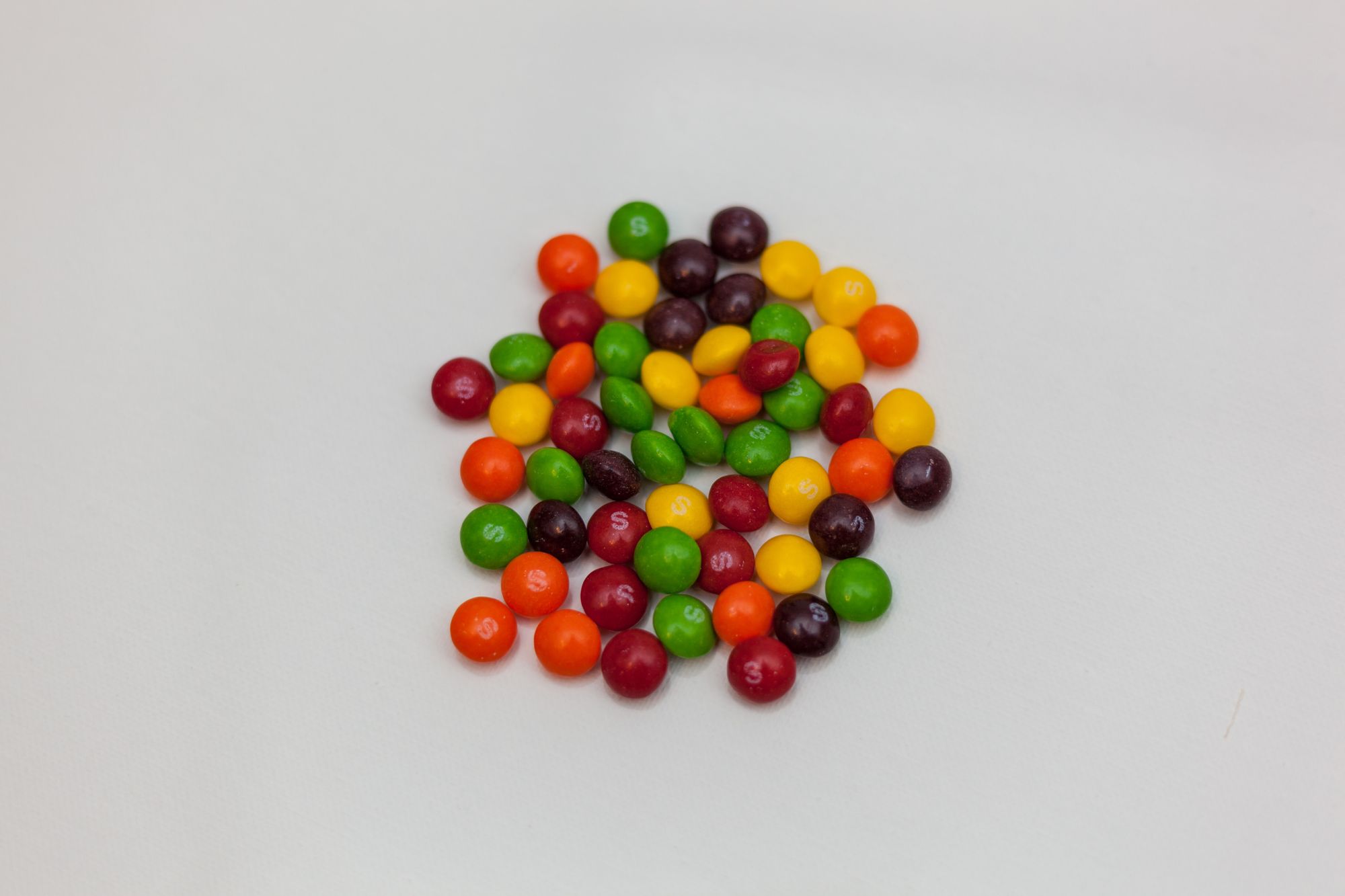
- Enough Skittles to fill cups with about 200 or so skittles each for each group. Two large bags works for my large class.
- Plastic drink cups.
Set up
I divided the students up into randomized groups no larger than 4. For this course, we had 13 groups of 4 students each. Each group receives a cup filled with skittles that are constructed to contain the same percentage of green skittles. In Fall 2017, each cup contained 23.1% green skittles. It isn't important that each cup contains the same number so skittles but it is important that the groups do not know what the percentage of green skittles is. A small lecture on sampling statistics is given to orient the students. I emailed the students this video ahead of the class:
Activity
Each group collects 30 random samples of skittles from each cup and counts the number of green skittles in each. The first 10 samples are of of size 5, the next 10 of size 20 and the last 10 of size 30. The number of green skittles are recorded in groups tab of the courses common google spreadsheet. (see materials) The correct percentages are computed and three graphs are shown illustrating the sample percentages taken by that group. For an example see below:


The students are then asked to make an estimate of the percentage of green skittles in their cups from the samples that they took. This will be deliberately difficult since they have a purposefully limited number of samples. I use this later on to talk about being skeptical of the results of single or a small number of studies.
Conclusion
The groups are then directed to redirect their attention from their group's tab to the 'Whole Class' tab. This page shows all of the samples that every group has taken. (these can be all combined since each cup is the same in terms of the parameter of interest.) Here they are presented with graphs of the all of the samples versus sample number and a histogram of the percentages of green for each sample size. Here are the individual samples for Fall 2017:


The students are asked to note the similarities and the differences between the graphs for each sample size. Most students notice:
- (n=5) seems more random and spread out.
- (n=30) seems to be "less random" and is the least spread out.
- For (n=30) they seem to be "getting close" to some number.
I use these observations later when the formula for "standard error" of a statistic involves the sample size. (and gets smaller then n is larger). I also use the "getting close" observation to explain the meaning of a having an "Unbiased" estimator.
And the histograms:


Student's generally see that the larger the sample size, the more 'bell shaped' the histograms are.
Then the students are asked to take all of the information shown and estimate the percentage of green skittles in their cups and to explain their reason for choosing the number that they did. For Fall 2017, a majority of the groups were within 1% of the true percentage of 23.1%. With many citing that they choose the peak of the histogram and others averaged the averages for each of the samples for the whole class.
This activity becomes a useful point to draw from when discussing how samples are used in Confidence Interval estimates and in Hypothesis Tests. Especially to help with the notion of p-val, confidence level, etc.. Which are very difficult to understand from their definitions alone.